Tips on Creating Awesome Instagram Feed
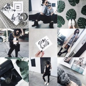
Useful articlesYour Instagram theme presents you, who you are, what you do, and what you love. There are no rules to follow, you make your own rules. But there are some tricks that can help you to choose a theme, and to stick to it.
 Your Instagram theme, color scheme and overall layout may determine if a visitor to your account is going to follow you, and come back to your profile.
When you bump into someone’s feed, you can feel instant envy of how beautiful their gallery is. Maybe you wanted to try using Instagram theme, but you don’t know where to start, how to choose, and how to stick to it.
It is especially important if you run your business on Instagram. Theme can help present your product in best possible way. If someone is thinking of collaborating with you, when they check your Instagram, they know exactly what they are going to get.
Here are some tips and tricks that can help you get started.
- White border theme
White borders space out your photos very nicely. Even if you post different photos.if you want to show different outfits, brands, or products. The pictures are different, but the the overall feed will look consistent. It looks simple, but it makes your posts stand out. There are few ways white order options. For example, you can use Mixed White Border Theme. You can achieve that look if you upload square or rectangle format. It will help you space out your photos,, and by that, highlight them.
- Black border theme
If there is white border theme, there has to be black border theme. The idea is the same.This theme helps you space out and highlight photos. It gives sophisticated and neat, magazine-like vibes. It is super popular for bloggers and influencers.
- Black and white
You just can’t go wrong with black and white! It is good for portraits, and it’s good for street photography. There is no color distraction, and you can also play with filters, from lighter to darker. You can play with textures, and give the pictures extra edge, by sharpening or blurring the lines, which can help the viewer enjoy the subjects on your photos even more!
- Minimalist
 You want very neat, and very organized feed? The less is more is the way to go. You can get this look by using filters to desaturate photo. This theme really shows your creativity and imagination.
- Color splash
This fantastic theme is very creative, and takes effort. You might need to use a third-party app, or photoshop. You can achieve this look by turning all picture to black and white, and than just highlight the area s where you want to have color.
- Color block
If you want to have colorful and playful feed, this is the theme for you. You can use high saturation, or light pastel colors. Very fun and popular at the moment, and easy to maintain. You can base your theme on monthly intervals and new product lines. This helps you incorporate products, lifestyle, and color mood, and still keep it seamless. You might want to use scheduling apps to plan your feed ahead.
- HDR-High dynamic range
This theme is popular for travel bloggers. The idea is to capture the great details and bright areas of photos.
- Flatlay
To take a flatlay photo, you must take pictures from above. Maybe standing on a chair. Taking pictures like this, you can tell a story of your day. What you ate, what you wore, where did you go, what are your favorite products to use, current mood etc.
- Same filter and tint
 You probably already have the favorite filter. And you can use it all the time. Your favorite filter can become your trademark. People can recognize your photo right away if you use same filter. This is pretty easy theme to maintain. It makes your feed look cohesive, shows your style, and overall mood.
You can use Tropical, grunge, Moody, Pastels, Browns..etc. If you are a fashion brand, or a fashion influencer, you can show seasons change, and with seasons, you can show fashion collections through quarter. It’s a subtle way of keeping your feed simple and consistent.
- Drawings in your theme
Another cool idea to show your creativity is to draw on your photos. It is definitely eye catching. And you don’t have to be a professional artist. Go to your Photo Editor, select the drawing tool, zoom in, and make a couple of strokes. You can even hand write in your photos.
This is just a couple of ideas on how to express yourself. Weather you run your business on Instagram, or you are a private user, you can have fun, choose your style. You can do it yourself, or use third-party apps. Which one is your favorite?
Read more:


